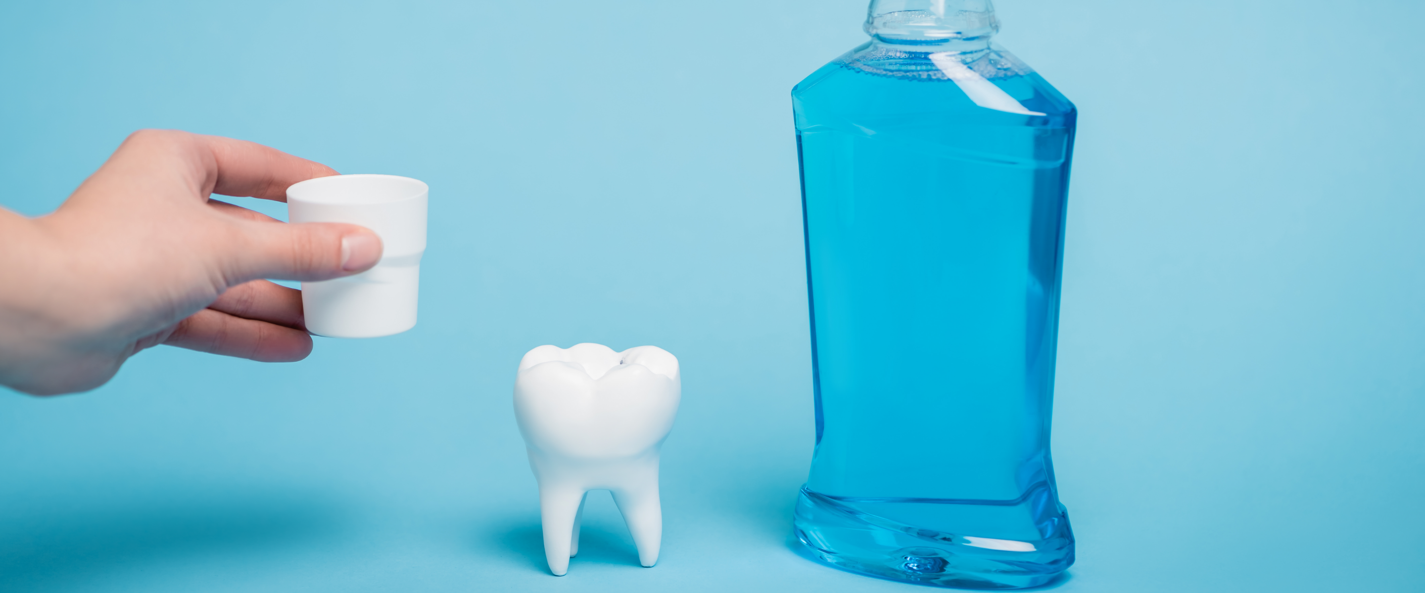
Ever looked at a bottle of mouthwash and wondered why it’s so... blue? Or green? Or turquoise-with-a-hint-of-neon? You’re not alone. Mouthwash has long been sold in vibrant colours, but have you ever stopped to ask why? And whether that colour actually does anything for your teeth?
Spoiler: it doesn’t.
So why is mouthwash usually blue or green?
It’s all about appearances. Bright colours in mouthwash were added decades ago to make the product *look* minty and powerful, even if that had nothing to do with how well it worked. It’s marketing, plain and simple. Blue means “fresh”, green means “clean”, and suddenly we’re conditioned to think clear = boring.
Here’s the truth about artificial colours
They don’t do a thing for your breath, your enamel, or your oral health. They’re just dyes, added for effect, not effectiveness. And for those of us who like our oral care a little more straightforward, they’re also totally unnecessary.
Why Waken goes clear
We decided to skip the colour completely. Why? Because mouthwash should work for your mouth, not for your eyes. Our clear formulas deliver all the essentials, without any of the filler. You still get:
- Fresh breath from natural peppermint extracts
- Fluoride to help strengthen enamel
- Stain prevention without harsh chemicals
- Alcohol-free formulas that are gentle, effective and clinically proven
No artificial colours. No unnecessary additives. Just clearly better mouthwash that does what it says it will, and leaves your mouth feeling fresh, clean and cared for.
The bottom line: clarity wins
At Waken, we believe in honest, effective, thoughtful oral care. That means leaving behind marketing gimmicks and focusing on what really matters: ingredients that work, and formulas that feel good to use. After all, it’s not the colour of your mouthwash that makes the difference, it’s the care that goes into every drop.
Don’t just clean. Care.

